
Visualizing Democracy
Design choices for clarity of presentation when there are too many data points
DATA STORYTELLING
Well, a bit of storytelling but mostly playing around with data and deciding how to present it.
Is democracy dying? Measures of democracy indicate that it is declining, at least. But how do you measure it? And having measured it, how do you visualize that measurement?
We are going to look at a history of democratic development from 1900 to the present day and see how we can visualize the data and tell stories with it.
Below is a view of how one measure of democracy has changed.

Until recently, the story has been one of continual rise, apart from a blip in the first half of the 20th century, which coincides with the Second World War and a sudden spurt in the early 90s during the fall of the Soviet Union. But there doesn’t seem to be any one particular event that has caused the downturn in recent years.
The measure of a democracy is subjective — I can imagine, for example, that Vladimir Putin and Bernie Sanders would have different views, or Viktor Orban and Brazil’s President Lula, or any number of different leaders with varying forms of democracy in their countries — but most reasonable people would doubtless agree that free and fair elections are paramount. There are other criteria, of course: Our World in Data characterises aspects of democracy as follows¹:
- Elected political leaders: broad elections choose the chief executive and legislature
- Comprehensive voting rights: all adult citizens have the legal right to vote in national elections
- Free and fair elections: no election violence, government intimidation, fraud, large irregularities, and vote buying
- Freedom of association: parties and civil society organizations can form and operate freely
- Freedom of expression: people can voice their views and the media can present different political perspectives
But let’s not worry too much about the characteristics of democracy, important as it is. Instead, we will concentrate on how we present the data that measures it.
We will use a dataset published by Our World in Data (OWD) ¹, which is grounded in data gathered by the Varieties of Democracy (V-Dem) project. We will accept V-Dem’s measures and consider how we visualize them.
You can find more information about the research methodology and how the data is collected and presented on the OWD and V-Dem websites.
For a quick look at how things stood at the end of 2024, see the chart below.

I’ve divided the world into seven regions (including the World itself) — that’s the x-axis. The y-axis is the V-Dem measure of democracy, a simple number that ranges between 0 and 1. The bars in the chart represent the averages of all the countries in each region. I’ve added a horizontal line so we can easily see which are above and below the World average.
Notice that while I’ve used blue to colour the entire chart, I’ve varied the shade. This not only makes for a slightly more attractive chart but also reinforces the weakness on the left of the chart as opposed to the strength on the other side.
It is important to note that these numbers are calculated by country, not by population. If we were to use a calculation based on population, we would see a different pattern.
Data wrangling
The regional chart is based on the data from OWD, which is a simple table of countries, years and the ‘Electoral democracy index (best estimate, aggregate: average)’, the V-Dem overall measurement of democracy.

The table is sorted alphabetically and includes a mixture of the regions seen in the bar chart and individual countries. I did a bit of data wrangling to get it into a more accessible state.
I first filtered the data so that it began in 1900, then I created four dataframes from that. First, I split the data into a country dataframe and a regions dataframe. To get the bar chart above, I created a regions dataframe for 2024 only and another similar one for countries. (All my code is in a Jupyter notebook, which I will link to at the end of this article.)
Designing the charts
This is all good until it comes to investigating the individual countries — there are just too many, 179, to be precise. That is far too many to sensibly put in a single chart. To give you an idea, the unreadable chart below is the 2024 scores for all countries.

You can make it a bit more readable by alternating colours, but something that big needs to be a horizontal bar chart, and even then, it’s far too long. Horizontal bar charts also have the benefit of being more accommodating of long labels such as country names. Here is a close-up of a horizontal bar chart that is made a little more readable by cycling through colours.
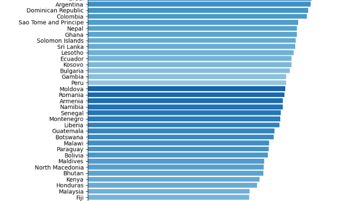
The image is a snapshot of the whole chart, which is why you don’t see the axis labels. This is less than a fifth of the complete chart, so just imagine how unwieldy the full chart is!
The only sensible thing to do here is to restrict the number of countries being looked at. Here are the 20 worst-performing countries in 2024.
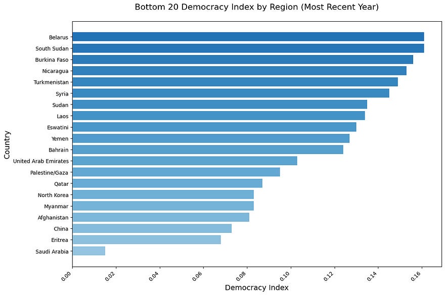
Again, I have used varying shades of blue for the bars to make them more distinguishable. The use of one colour gives coherence to the chart as a whole; multiple colours would still have been distinct but more distracting.
Using alternating colours, as you often see in tables, would also work. Or you could try a slightly different form of bar chart, the lollipop chart.

In the chart above, the bars are thin lines which provide good separation, while the circle at the end of the lollipop provides a more easily seen marker for the value.
Data stories in history
Let’s go back to the chart that tracks the democracy index for the World.
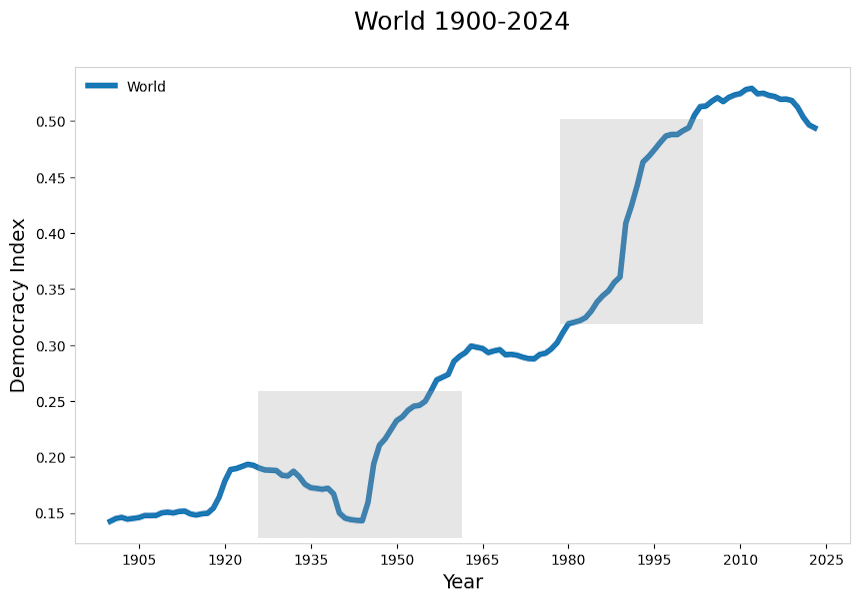
In this version of the chart, I’ve highlighted areas of interest where there were significant changes in the democracy index.
The first was around the Second World War.
During the 1930s, several European countries fell under authoritarian rule. Germany, Italy, Spain and Portugal, for example, were all ruled by dictators. Then, during the Second World War (from 1939), Germany invaded various European countries, bringing those democracies under authoritarian rule, too. At the end of the war, France and other countries that had been invaded returned to democracy, as did Western Germany and Italy (although the Soviet Union, which had liberated much of Eastern Europe, came to dominate those countries).
The chart below demonstrates a gradual decline in the 1930s and a sudden one at the beginning of the War. And as can easily be seen, the end of the War resulted in a sharp uptick in democracy.

In the chart below, we can see how the democracy index changed for three of the countries invaded during the War.

The other time of interest is the 1991 collapse of the Soviet Union. Countries that were part of, or closely aligned with, the Soviet Union were suddenly allowed to become democratic. In the chart below, you can see the surge in the index for 5 of the countries affected. However, with the notable exception of Estonia, the democratic trajectory of those countries has been complex, and they have all recently declined.
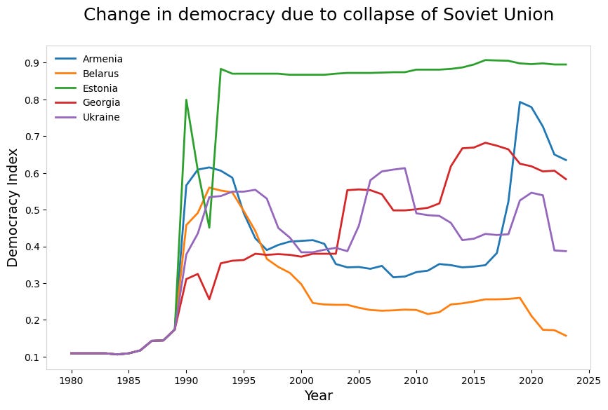
With five countries being charted, we have a just-about-readable chart. Add a few more, however, and we would end up with something that resembles a plate of colourful spaghetti.
A better approach, when there are too many traces to comfortably fit in a single chart is to create subplots.
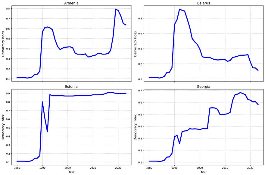
In the chart above, you can fairly easily relate the different traces, but the result is much cleaner.
Wrap up
I hope you’ve found this interesting or useful. It’s been a simple walk through a data set where I’ve identified a couple of stories that stand out and made some design decisions that I hope show the data in a better light.
All the charts here were created with Matplotlib, except the grey WW2 and Soviet Union highlights, which were added later. I haven’t shown the code here, but it will all be available in a GitHub repository that I will link to shortly after publication.
As ever, thanks for reading. To see more of my articles, follow me on Medium or subscribe to my Substack.
The code and data for this article can be found in my GitHub repo. I will place a link to it here shortly after publication.
Currently, although paid subscriptions are open, you won’t get anything extra - this may change in the future. But if you feel inclined to support my work regularly, you could do this. If you don’t want to, that’s fine, just take out a free subscription. Or, if you don’t want to get stuff in your inbox, just follow me.
Or if you don’t want to subscribe but enjoyed this article, you might want to…

Notes
Bastian Herre (2022) — “The “Varieties of Democracy” data: how do researchers measure democracy?” Published online at OurWorldinData.org. Retrieved from: ‘https://ourworldindata.org/vdem-electoral-democracy-data', April 2025. Note that all OWD content is published under a Creative Commons licence.
Coincidentally, John Loewen, PhD has written an interesting piece using similar data. Having Streamlit Superpowers: The Best GPT-4 Prompts For Guaranteed Data Visuals is a good read, particularly if you like the idea of “No-fuss prompting for error-free Python Streamlit data viz code”. I just wanted to point out that this really is a coincidence — I already had this article in progress when John published his.