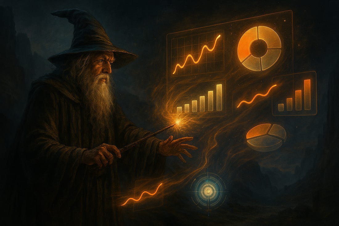
Vibe Analysis: Conversational Data Exploration with Streamlit and LLMs
How to summon up a customised data dashboard from your data in plain English.
You have a new data set, a CSV file, so you spin up a Jupyter Notebook, import pandas, numpy, matplotlib, whatever… create a dataframe and start wrangling the data, building pretty much the same old charts that you made last time.
It’s fine, it works, you’ve done it all before. It’s not difficult, but isn’t it just a bit… tedious?
How about a different approach? How about, like the guy in the pointy hat above, you command the visualisations to appear, and they obediently do so?
I’ve been experimenting with the Gemini CLI for data analysis and the automatic production of interactive Streamlit dashboards from that data.
The following non-paywalled articles show my approach…

