px_xtras: Beyond Plotly Express, More Beautiful Charts
What do Waffle, Waterfall and Dumbbell charts have in common? They’re not in Plotly Express — px_xtras to the rescue!
Of course, you’ve used Plotly Express to create quick and beautiful charts, and you know how easy it makes data visualisation in Python. But if your needs grow beyond the standard offerings, you might find yourself tangled up in complex Plotly Graph Objects (GO) code.
That’s where px_xtras comes in.
What is px_xtras?
px_xtras is a Python library that mimics the simplicity of Plotly Express to hide the complexity of Plotly GO. It offers a clean, high-level interface to create new visualisations with just a few lines of code.
And, of course, it plays nicely with popular frameworks like Streamlit or Taipy and anywhere else you can use Plotly charts.
The current range of charts includes:
Waterfall charts
Waffle charts
Dumbbell charts
Lollipop charts
Slope charts
Metric — a text-based visualisation of changing data
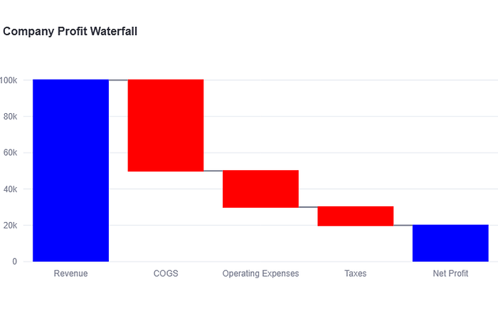
Here is an example of the code for a Waterfall Chart:
# Waterfall Chart)
wf_data = pd.DataFrame({
“Category”: [”Revenue”, “COGS”, “Operating Expenses”, “Taxes”, “Net Profit”],
“Value”: [100000, -50000, -20000, -10000, 0],
})
fig_wf = pxx.waterfall(df=wf_data,
categories_col=’Category’,
values_col=’Value’,
title=”Company Profit Waterfall”,
)
st.plotly_chart(fig_wf
And here is the result:
You can read the full article here:
px_xtras: Beyond Plotly Express, More Beautiful Charts
(Medium - no paywall)
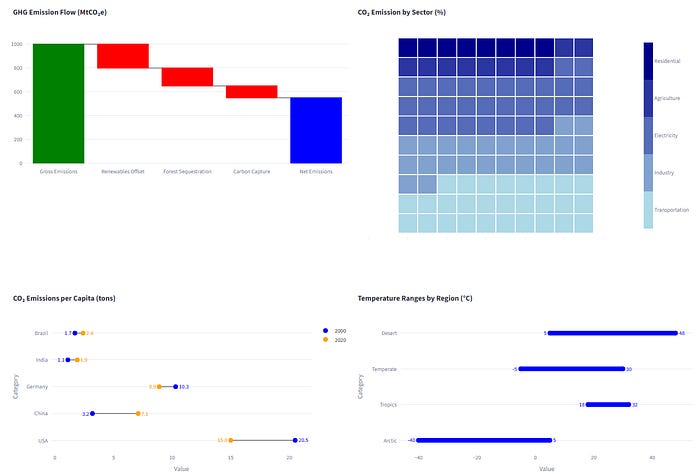
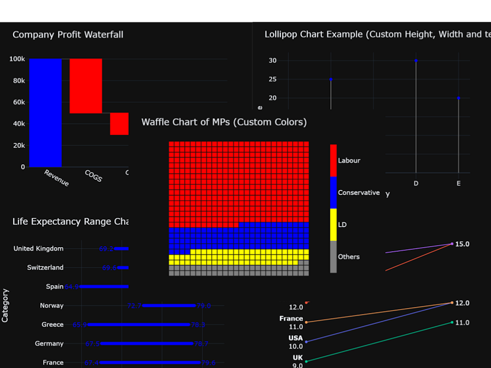
And here are some more example charts: