Pandas Plots: Matplotlib Made Easy
Matplotlib is a powerful charting library; Pandas plots are the same, but simpler.
Matplotlib is powerful but can be daunting as it can get verbose when you move beyond basic charts. If you don’t need that level of granular control, there’s a faster path to great visuals: the built-in plotting tools in Pandas. They deliver clean, effective charts with a fraction of the code, letting you focus on insights instead of syntax.
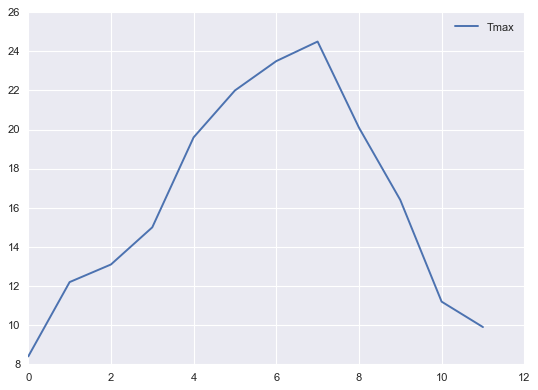
As you might expect, the Pandas plotting library is designed to plot data provided as Pandas dataframes; indeed, the plotting methods are methods from the dataframe class. In the examples below, we will use a dataframe named weather that records the weather in London in the year 2024. To draw a simple line chart of the maximum monthly temperatures, you would write the code below:
weather.plot(x=’Month’, y=’Tmax’)This is about as simple as it gets. Unless we specify otherwise, the default plot is a line chart. In the code, the plot method from weather is given values for the y and x parameters and will draw the appropriate line chart.
The rest of this article covers the basic charts available from Pandas; future articles will look at statistical charts and customisation.
Carry on reading for free here…


