More Visualization, and Sentiment Analysis
Plus a summary of my most popular articles
Hello again! I haven’t written a newsletter for a while, so there is a little catching up to do here. Here is a list of my latest and most popular Medium articles.
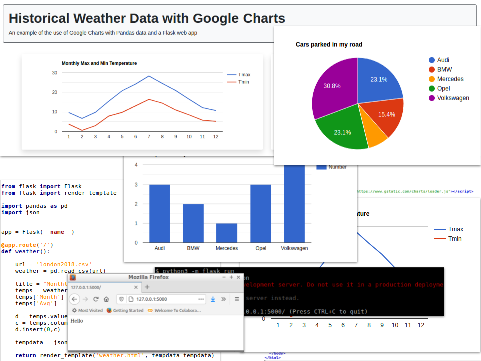
There’s more visualization in this newsletter. It seems to me that Google Charts have been a little ignored recently and may they don’t easily interface with Python and Pandas. This latest article sets out to remedy that.
How to Create Simple Visualizations with Google Charts and Pandas Dataframes (with an example website and downloadable code).
Twitter gives you the ability to see how people are engaging with your own tweets but how are others doing?
Visualizing Twitter Statistics with Python and Pandas (with an example website and downloadable code).
Marketing departments are keen to know how customers react to their brands. Here’s a method for doing that:
Sentiment Analysis of Tweets (with an example website and downloadable code).
An oldie but one of my most popular articles:
More data visualization but in the Julia language. Choose your environment, VSCode, Juno or Jupyter Notebooks.
This is a personal favourite. ggplot is famously used to produce excellent graphics in the R language. Here is a version for Python.
SQL is built into Python by means of SQLite. Here is how to use it with Pandas.
Want to make you Jupyter notebooks into beautiful documents? Add some Markdown!
Need to plot a regression line on your line or scatter chart? Numpy comes to the rescue.
this newsletter is a relatively new venture and I would greatly appreciate it if you could share it with your friends. I have hundreds of followers on Medium but only a handful here.
And if you haven’t done so already…

