
Data Analysis and Visualization with Gemini and Google Colab
Let AI take the strain

I’ve been away for a little while, wandering around the woods of rural England, doing very little and not being online. Before I disappeared, I discovered that Google has integrated its Gemini LLM into its online Notebook environment Colab. Here is the result of my experiments in getting Gemini to automatically analyse and visualize data using a public data set about the popularity of various programming languages.
Ok, forget everything I’ve said in the past about using AI to create data visualizations. This could make everything else redundant.
Just open a Google Colab notebook, upload your data and ask its Data Science Agent to do all the work for you.
Google’s Data Science Agent is based on Gemini, its LLM offering. It is incorporated into Colab and can simplify data analysis by automating the creation of complete Jupyter notebooks. It has two modes: at the cell level, it lets you prompt Gemini to generate code there in the cell, but it can also generate entire notebooks from data files and a user prompt. Additionally, Gemini can also explain errors in your code and fix them.
According to Gemini itself, the agent's benefits include:
Fully functional Colab notebooks: Not just code snippets, but complete, executable notebooks.
Modifiable solutions: Easily customize and extend the generated code to fit your specific needs.
Sharable results: Collaborate with teammates using standard Colab sharing features.
Time savings: Focus on deriving insights from your data instead of wrestling with setup and boilerplate code.
So, let’s give it a whirl and see how it works.
We’ll give it a dataset that tracks the popularity of 30 programming languages over time. Then we’ll ask it to analyse the data. Gemini will come up with a plan which you can accept (or you can ask for modifications) and it will then execute that plan, creating code cells and executing them to complete the tasks it defined in its plan.
Later, we’ll look at what happens when we prompt the agent to produce a more directed plan that specifies our particular interests.
First, however, we will be lazy, accept a default plan, and let Gemini go its own way.
You’ll need a Google account to run Colab. If you are not familiar with it, it is essentially a Jupyter Notebook running on a Google server but with extras. To quote Google’s Gemini:
“Colab provides free access to computing resources, including GPUs and TPUs, making it suitable for machine learning, data science, and education”
It's free to use, but the availability of resources may vary depending on demand. You can find it here:
https://colab.research.google.com/
The data and the notebooks for this exercise will be available for download from my Github repo shortly after publication. See the Notes below for details.
Colab with Gemini
When you first log in to Colab, you need to create a new notebook, which will look very much like a standard Jupyter Notebook. However, below the initial empty code cell, you will be presented with a button that invites you to “Analyse files with Gemini”.

Click on that and you will be prompted to upload a file. The file I uploaded looks like the screenshot below.

It is a simple table of the popularity of programming languages from July 2004 to the end of 2024. The numbers in the language columns are percentages and represent the proportion of users of a language (see Notes).
You should be aware that the data you upload will disappear when you finish your Colab session. (In the notebooks I provide for download, I have substituted the reference to a local file with an external source so the data will be persistent across sessions. You can upload these notebooks to Colab or run them in a local instance of Jupyter.)
A generic plan
After I uploaded the data, I was invited to ‘Analyse Files’. Having done that, Gemini responded thus:

The response will be tailored to whatever file you upload, of course.
You can ask for changes, although for this exercise I accepted the default plan and executed it.
Time to make a cup of tea.
Actually, executing the plan doesn’t take that long with this fairly small file, but with a large dataset, I can imagine you might have to wait a while for Gemini to work through the various tasks.
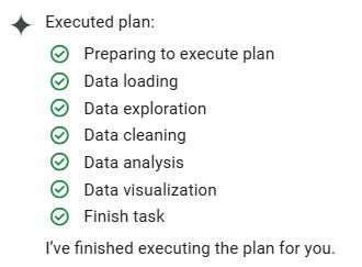
Gemini keeps you posted about its progress, gradually ticking off the tasks as they are completed.
And, hey presto, we have a complete notebook with code cells for each task. Sometimes, Gemini will create coding errors. When this happens, it will attempt to retry the code in a new cell. When Gemini runs the notebook, it will run all the cells even though there was an error, but if you try to re-run it, it will stop at that point. To get a fault-free run, you need to manually remove the guilty cell.
Since we have given no direction on how to proceed, Gemini’s plan is fairly generic and not necessarily suitable for our purposes. But let’s see what it has done for us.
Each task in the plan is coded in a separate Jupyter cell, and this is preceded by a text introduction. We’ll go through each one.
Data Loading: This simply loads a local CSV file into a dataframe and prints out the
head.Data exploration: This stage prints out the shape of the dataframe and the datatypes. It checks for missing values (there are none) and then prints statistics for each column (i.e. language).
Data cleaning: Here, the
Datecolumn is converted to a datetime format.Data analysis: This task analyses the trends in programming language popularity over time. It calculates the average popularity for each programming language, determines the peak popularity and corresponding date, identifies significant changes in popularity, and calculates the average popularity per year for each language. The first attempt at doing this failed as Gemini tried to operate on a
Yearcolumn that it had created, which was not a numerical field. It automatically made a second (successful) attempt to correct the original mistake.Data visualization: Gemini produces the code to plot various graphs in Matplotlib — popularity over time, average popularity and so on.
Here is a sample of one of the visualizations; it tracks the popularity of programming languages over time using the average for each year.

Following these operations, Gemini comes up with a Summary telling us what it has done and suggesting further steps.

You have to bear in mind that Gemini was given no instructions other than to analyse the data. So, it has produced a generic plan and then executed it. If we had wanted something different, we could have asked for it (see below).
Generating new cells.
That needn’t be the end of the story. Gemini is active inside each code cell. Each time you create a new code cell, you will see this:

Click on ‘generate’ and you will be shown a dialog box in which you enter a prompt. Gemini already knows about the Notebook and will happily generate the code for a new cell. For example, I asked it to
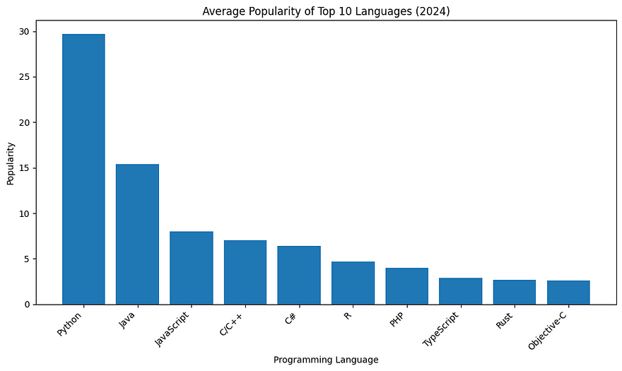
“Create a plot from the original data that plots the average popularity of the top 10 most popular languages for 2024. The result should be a bar plot.”
It dutifully produced the code to draw the bar chart, but there was a bug. Here is the code that it generated:
# prompt: Create a plot from the original data that plots the average popularity of the top 10 most popular languages for 2024. The result should be a bar plot.
import matplotlib.pyplot as plt
# Assuming 'df' is your DataFrame from the previous code
# Get the latest popularity data (2024)
latest_data = df[df['Date'] == df['Date'].max()]
# Drop the 'Date' and 'Year' columns
latest_popularity = latest_data.drop(['Date', 'Year'], axis=1).iloc[0]
# Sort by popularity and get the top 10
top_10 = latest_popularity.sort_values(ascending=False).head(10)
# Create the bar plot
plt.figure(figsize=(10, 6))
plt.bar(top_10.index, top_10.values)
plt.xlabel("Programming Language")
plt.ylabel("Popularity")
plt.title("Average Popularity of Top 10 Languages (2024)")
plt.xticks(rotation=45, ha='right') # Rotate x-axis labels for better readability
plt.tight_layout()
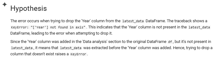
plt.show()It got a little confused about the column name ‘Year’. This is something that Gemini itself created and is not in the original data. It is easily fixed manually, but it is useful to know that Gemini is capable of fixing its own errors. After an error message you are presented with an ‘Explain error’ button. Click this and the Gemini window displays the problem, a hypothesis (what it thinks caused the error), and a fix.
It correctly diagnosed the error:
It then went on to produce the correct code (instead of dropping the ‘Date’ and ‘Year’ columns, it just dropped ‘Date’), which drew the chart below.
I tried a different prompt in the next cell.
Compare how the popularity of Python compares with a combination of Javascript and Typescript.
JavaScript and TypeScript do much the same job, and I would think that at least some of the decline in the use of JavaScript can be attributed to developers moving to TypeScript. So this prompt asks the agent to combine the two languages and compare them with Python.
Gemini produced the following code.
import matplotlib.pyplot as plt
# Calculate the combined popularity of JavaScript and TypeScript.
df['JavaScript_TypeScript'] = df['JavaScript'] + df['TypeScript']

# Calculate the average popularity of Python and the combined JavaScript/TypeScript.
avg_python_popularity = df['Python'].mean()
avg_js_ts_popularity = df['JavaScript_TypeScript'].mean()

print(f"Average popularity of Python: {avg_python_popularity}")
print(f"Average popularity of JavaScript and TypeScript combined: {avg_js_ts_popularity}")

# Find the peak popularity and corresponding date for Python and combined JavaScript/TypeScript
peak_python_popularity = df['Python'].max()
peak_python_date = df.loc[df['Python'].idxmax(), 'Date']

peak_js_ts_popularity = df['JavaScript_TypeScript'].max()
peak_js_ts_date = df.loc[df['JavaScript_TypeScript'].idxmax(), 'Date']

print(f"\nPeak popularity of Python: {peak_python_popularity} on {peak_python_date}")
print(f"Peak popularity of JavaScript and TypeScript combined: {peak_js_ts_popularity} on {peak_js_ts_date}")

# Plotting
plt.figure(figsize=(12, 6))
plt.plot(df['Date'], df['Python'], label='Python')
plt.plot(df['Date'], df['JavaScript_TypeScript'], label='JavaScript + TypeScript')
plt.xlabel('Date')
plt.ylabel('Popularity')
plt.title('Popularity of Python vs. JavaScript + TypeScript')
plt.legend()
plt.grid(True)
plt.xticks(rotation=45)
plt.tight_layout()
plt.show()
Which comes up with the following text output as well as the chart that follows.
Average popularity of Python: 14.725691056910566
Average popularity of JavaScript and TypeScript combined: 8.893536585365853

Peak popularity of Python: 31.41 on 2020-07-01 00:00:00
Peak popularity of JavaScript and TypeScript combined: 12.469999999999999 on 2023-06-01 00:00:00
Gemini has responded to the prompt correctly. And we can see that both lines in the graph show a general increase in popularity, but with Python surging ahead from around 2016 and JavaScript/TypeScript declining a little recently.
A more directed prompt
That’s one way of using the agent, but probably a more productive method is to tell the agent what you are interested in.
I went through the same exercise, but this time, instead of simply asking it to analyse the data, I gave it this prompt:
We are interested in how Python has increased in popularity as a language for AI and how Typescript might be replacing Javascript as a front-end language.
And this was the plan that the agent proposed.

As you can see, the plan is much more focused than the previous generic one and concentrates on the languages that we were asking about.
The data analysis and visualisations concentrated on the growth in popularity of the three languages and below you can see a chart that highlights Python’s periods of significant growth in popularity.

The full analysis and the charts generated can be seen in the notebook. Below, you can see that the summary that Gemini produced was very relevant, and it provided sensible suggestions for further investigation.

Conclusion
Google’s Data Science Agent is a very easy-to-use feature in Colab, just upload the data file(s) and write a suitable prompt to guide the agent’s analysis, and it will generate a plan, execute it and produce an entire notebook for you based on the data provided.
If you only give it a vague prompt, then the agent will produce a generic analysis. So it is worth putting in some effort to think about what you need from the analysis and writing a prompt that explains this. The better the prompt, the more useful the result.
I have only given you a brief look at the analysis, visualizations and code that Gemini created. I would encourage you to look at the full notebooks in the repo where you will see the entire analysis, all of the charts, the code and the commentary that Gemini produced.
I have found the combination of Gemini and Colab to be quite satisfying to use — easier than some other AI-supported tools, and I suspect I may continue to use it in future. Take a look at it and, if you feel like it, write a comment about your experiences below.
As ever, thanks for reading and I hope that this has been useful. To see more of my articles, follow me on Medium or subscribe to my Substack.
Notes
The data comes from the Kaggle dataset Most Popular Programming Languages Since 2004 by Muhammad Khalid, accessed 29th April 2025. A copy of the version used here can be found in my GitHub repo, here.
All the code and data can be found in the repository, here.