12 Essential Visualizations and How to Implement Them - a Free Interactive Course
Learn how to create the 12 most useful graphs and charts in Python with this interactive web-based course
Learn by doing: an interactive course on how to create the 12 most useful graphs and charts in Python.
“When I look back over the 150+ visuals that I created for workshops and consulting projects in the past year, there were only a dozen different types of visuals that I used”, Cole Nussbaumer Knaflic in Storytelling with Data, a data visualization guide for business professionals (affiliate link)
Cole Knaflic’s book is a comprehensive look at data visualization and one of the first things you learn is that she relies on only 12 different types of visuals.
They are:
Text - sometimes text is all you need and can be clearer than a graphic
Tables - a plain table allows the viewer to easily look up a data point
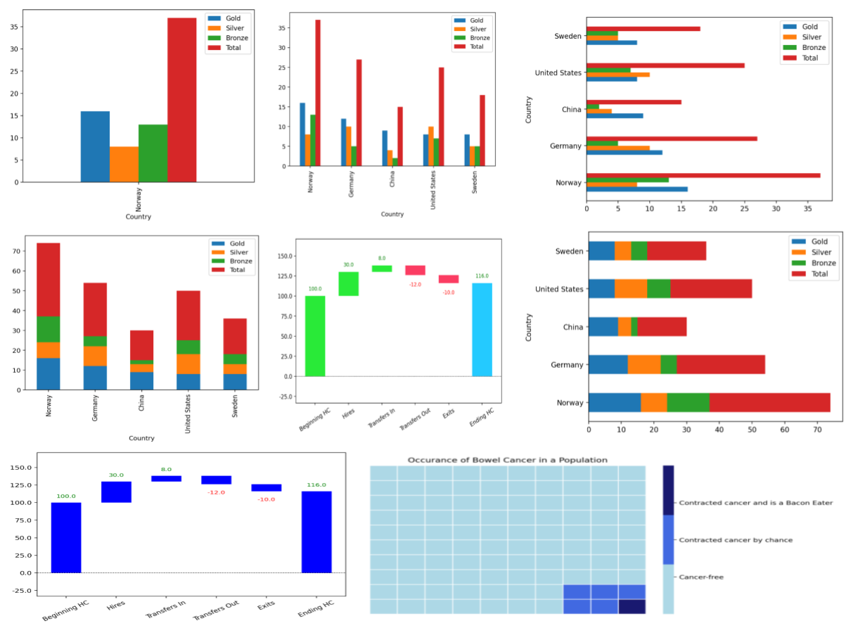
Heatmap - these represent data values with colour and can be very effective visual aids
Scatter Diagrams - often used to demonstrate correlations between two sets of data
Line Charts - typically used for time series, they are easy to interpret
Slope Charts - a specific type of line chart that compares pairs of values
Bar Charts - probably the most used chart to visual data useful just because of that, they come in several varieties
Waterfall Charts - decomposed stacked bar charts that show changes in value over time - often not included in charting libraries
Square Area Charts - often easier to interpret than a standard area chart
This online course is a bit of an experiment. It leverages PyScript in order to present a Python code window in which to run and edit the code. It is based on the two articles that I wrote on Medium a while back.
The two articles show how to implement, in Python, each of the 12 visuals that Knaflic identifies. The articles give examples in Streamlit and Matplotlib but there is also a Jupyter Notebook version of all of the code, as well.
12 Essential Visualizations and How to Implement Them - Part 1
12 Essential Visualizations and How to Implement Them - Part2
(Medium articles - no paywall with these links)
All the code from the articles is available from my Github repository.
The code in the course is a little different to that in the articles so that it is compatible with PyScript, for example, the Python library for waterfall charts is not available to PyScript, so I’ve changed the implementation to one using Plotly, instead.
As this is an experiment, I would appreciate any feedback - good or bad - please leave a comment on this post.

